

mint bronze
& beauty
Services Provided:
background:
Mint Bronze & Beauty is a sunless airbrush tanning company with multiple locations across California. When founder Cherie launched her own line of tanning solutions for wholesale, she reached out to me for packaging design, but the project quickly evolved into a full rebrand. What started as a packaging refresh shifted when I noticed the original tagline clashed with the existing logo. To create a brand that felt cohesive both visually and verbally, we decided to give Mint Bronze & Beauty a complete makeover. We began with a mood board to lock in the look and feel. I envisioned something clean and fresh, but with a subtle edge. Alongside mint green and deep inky black, we introduced warm brown tones inspired by the name of her new solution line: The Latte Collection. For the logo, I selected a timeless serif to ground the brand in elegance, and brought in a bold, airbrushed font (a nod to the original logo) for accent typography — blending heritage with a modern twist. Once the brand identity was finalized, I created several mockups to show Cherie how the elements worked together, using an Instagram feed-style layout to visualize the brand in action. From there, we rolled out three packaging variations for each bronzer base: Matcha Latte, Choco-Latte, and Spiced Latte. Scroll down to check out my work.
- Social Media Graphics
- Social Media Strategy and Management
- Rebranded Identity
- Packaging Design
- Product Photography
mint bronze & beauty
Services Provided:
- Rebranded Identity (logo, alt. logo, submark, typography, color palette)
- Packaging Design
- Product Photography
- Social Media Graphics
- Social Media Strategy and Management
background:
Mint Bronze & Beauty is a sunless airbrush tanning company with multiple locations across California. When founder Cherie launched her own line of tanning solutions for wholesale, she reached out to me for packaging design, but the project quickly evolved into a full rebrand. What started as a packaging refresh shifted when I noticed the original tagline clashed with the existing logo. To create a brand that felt cohesive both visually and verbally, we decided to give Mint Bronze & Beauty a complete makeover. We began with a mood board to lock in the look and feel. I envisioned something clean and fresh, but with a subtle edge. Alongside mint green and deep inky black, we introduced warm brown tones inspired by the name of her new solution line: The Latte Collection. For the logo, I selected a timeless serif to ground the brand in elegance, and brought in a bold, airbrushed font (a nod to the original logo) for accent typography — blending heritage with a modern twist. Once the brand identity was finalized, I created several mockups to show Cherie how the elements worked together, using an Instagram feed-style layout to visualize the brand in action. From there, we rolled out three packaging variations for each bronzer base: Matcha Latte, Choco-Latte, and Spiced Latte. Scroll down to check out my work.
%20(2).png)
mood board

packaging guidelines
brand board

sample social grid

packaging guidelines

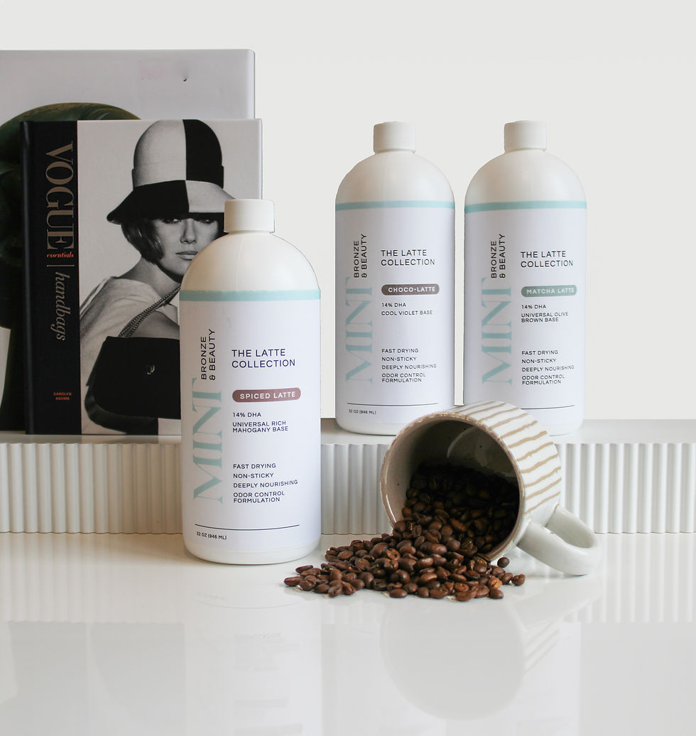
packaging
I created labels for 3 different solutions and 3 self-tanning mousse variations, all under "the Latte Collection" line.


product photography
.jpg)
.jpg)

.jpg)
After creating the labels for the solution and sunless-tanning mousse, I took on brand product photos to be used for social media and on Mint Bronze & Beauty's website.
.jpg)
.jpg)

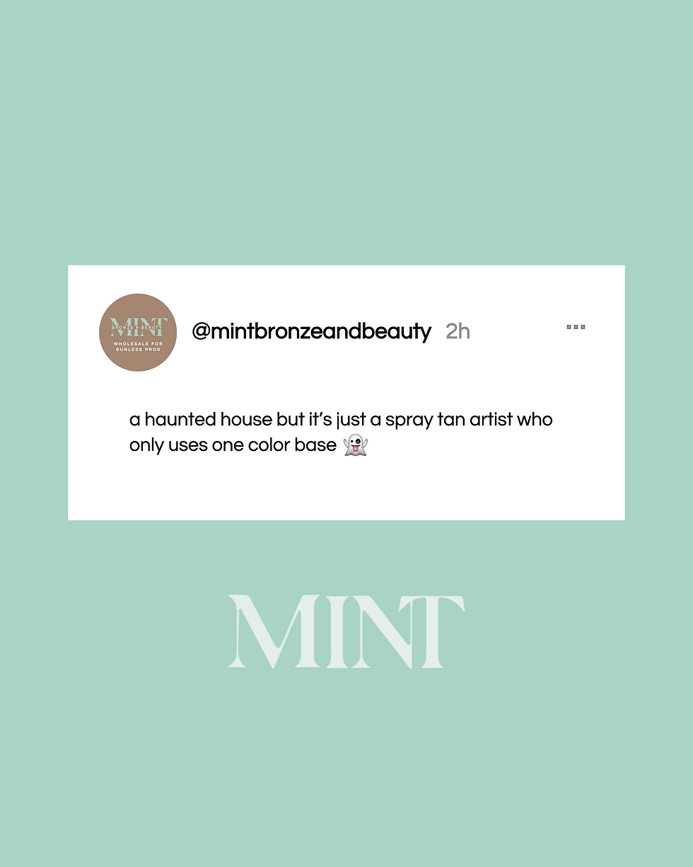
social media posts
In order to promote their wholesale line and education services, Cherie started an Instagram page specifically for sunless pros. I stepped in for two months to help build the feed, optimize the bio, and create highlights with covers. Each post I made included a caption and relevant hashtags. We also held multiple successful giveaways to promote the Mint Bronze & Beauty line.

.png)
.png)


“Working with Sam on our rebrand and product launch was an absolute pleasure and a true game-changer for our business. From the moment we started, her sweet demeanor and incredible creativity shone through, making every step of the process enjoyable and highly productive. Sam not only helped us redefine our brand identity with a fresh, modern aesthetic, but she also meticulously designed our product labels, ensuring they perfectly captured the essence of our offerings. Her keen eye for detail and understanding of the beauty industry were evident in every design element. Beyond that, her expertise in curating and managing our Instagram posts for our wholesale account was invaluable, significantly enhancing our professional presence and appeal to key industry professionals. She is truly easy to work with – collaborative, responsive, and always bringing innovative ideas to the table. If you're a beauty industry professional looking for a graphic designer who can elevate your brand with creativity, precision, and a genuinely delightful approach, we wholeheartedly recommend Sam. She delivers exceptional results that speak for themselves".
”
-Cherie S. // owner/founder of Mint Bronze & Beauty